Reimagining the modern dating experience
IOS MOBILE | SOCIAL PLATFORM
PROJECT OVERVIEW
SKILLS
Research
User Interviews
Design Systems
Prototyping
ROLE
Lead Product Designer
(6 designers)
PLATFORM
iOS Mobile
TIMELINE
6 Weeks
(Jan - Feb 2020)
CLIENT AND CHALLENGE
Fireside Social's mission is to deepen relationships by asking questions that facilitate deeper conversations. With an existing site for users to grow closer to their social networks through weekly question prompts, customers were interested in a dating version for mobile. The client approached us to build a minimum viable product (MVP) showing how user interactions would play out on a mobile app.
FRAMING THE OPPORTUNITY
Dating app fatigue is real - people are tired of the small talk
How might we reimagine the modern dating experience that aligns business and user incentives with human nature?
SOLUTION
A new way to form romantic relationships that’s engaging, fun, and meaningful again
Online dating should feel rewarding
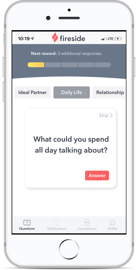
You decide which category of questions you want to answer and how fast you make progress towards rewards.
Meet your match with a little help from Fireside
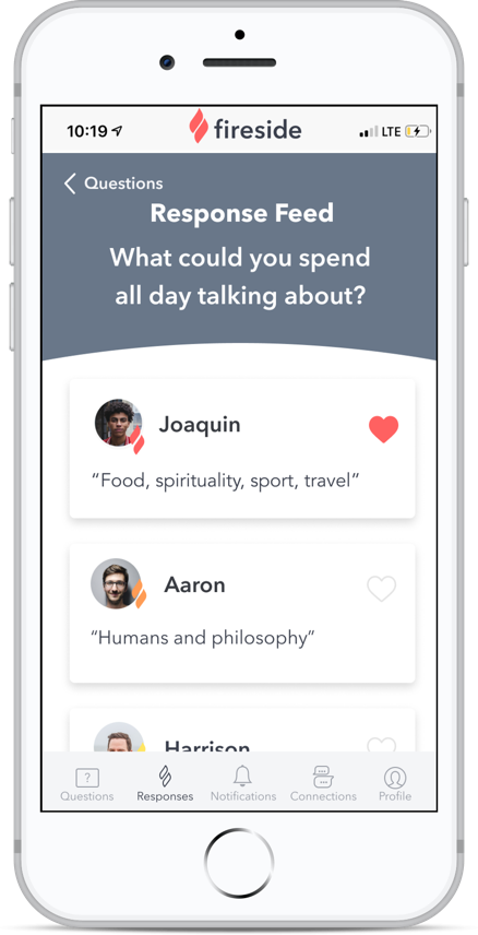
Fireside uses meta-analysis to suggest top matches based on how you’ve answered questions. Compatibility is color-coded by red, orange, and yellow flames.
Say goodbye to superficial dating
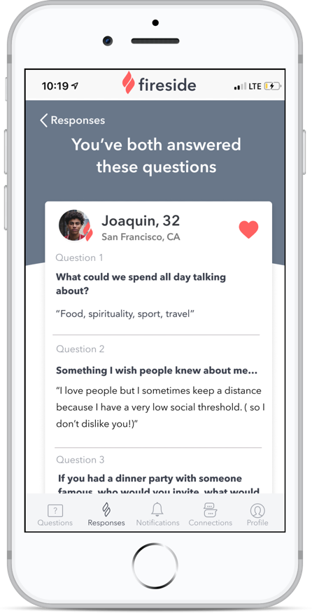
Before hitting ‘like,’ get to know a user by reading answers to questions you’ve both answered.
We understand that you’re human, too
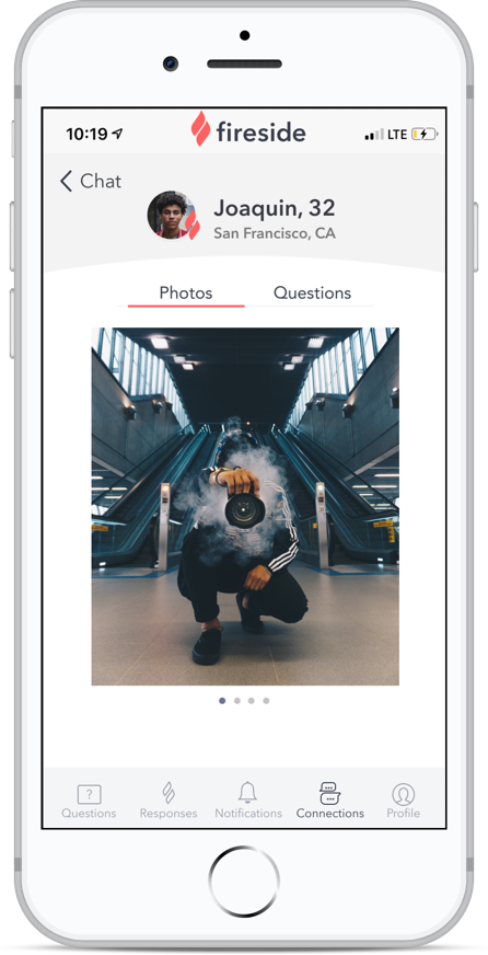
We know that photos are important when it comes to potential matches. After chatting, go ahead and unlock photos to get a fuller picture of the person.
Here to help you learn about yourself in the process
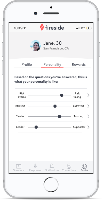
The more questions you answer, the stronger your personality profile will be through meta-analysis.
CONTEXT
There are 1,500 dating apps and websites - why haven’t we got it right?
Understanding the problem on a human level
Two articles I found particularly insightful were Julie Beck’s, “The Rise of Dating App Fatigue” and Doctor Rob Whitley’s “Are Dating Apps Damaging Our Mental Health?”
Top findings were:
54% of users report feeling lonely after swiping through profiles
Meaningful prompts that let users share their personality lead to longer dating app conversations
Users may not know or admit all aspects of what they want - behavior and metadata can be more informative
Dissecting what's out there
I compared features that popular dating solutions had to offer in order to figure out a blue ocean strategy for Fireside.
Considering Fireside’s capabilities and overarching mission, we aim to:
Raise deeper conversations
Raise meta-analysis
Reduce extensive bios and photos
DESIGN ITERATIONS
Uncovering new needs at each level of fidelity and user test
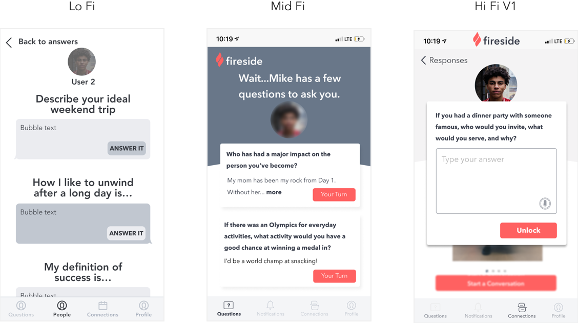
Traditional mobile dating apps focus on viewing others’ profiles. But what if we forced the user to introspect? My early explorations included a diary concept, a detailed profile page, and a random question generator. Through feedback from other designers and the co-founder, simplicity took precedence and I landed on question cards.
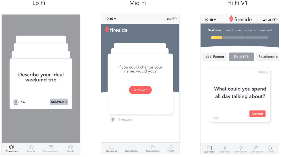
Question Cards: Applying gamification principles to increase engagement
Users from testing felt overwhelmed seeing a stack cards so I reduced it to one card at a time. I also categorized question cards, giving users control over the topic covered, as well as built a rewards progress bar to incentivize users to answer more questions.
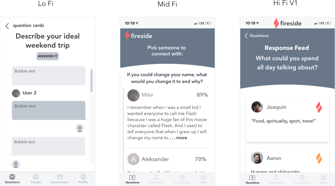
Response Feed: Using real user data and exploring compatibility indicators
The length of responses in the mid fi version was overwhelming to users. Though this was filler text, I sent target users an anonymous survey with example questions to find out how they would respond. The average response length of 12 participants was only 45 characters, mitigating text length concerns. Real responses are also included in the final prototype.
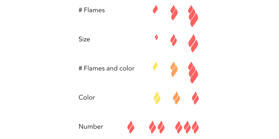
Compatibility Indicator Considerations
With feedback from the co-founder and lead engineer, I found that a quantitative measure like percentages makes gauging compatibility difficult due to the large range of numbers it allows. I explored qualitative measures for the hi fi version by adapting components from Fireside’s existing design system. Though strays from the color palette, I ultimately chose color as compatibility indicators because it was the clearest to understand for users.
Unlock Profile: Making tradeoffs between business and user goals
User testing revealed that answering 3 questions to start a chat was a large barrier and caused frustration. I tested the mid fi with 2, but it still posed a point of friction in the experience. Though reducing it to 1 question means less data collection, the tradeoff is worth it for the sake of more engaged users and higher retention rates.
TASK FLOW ANALYSIS
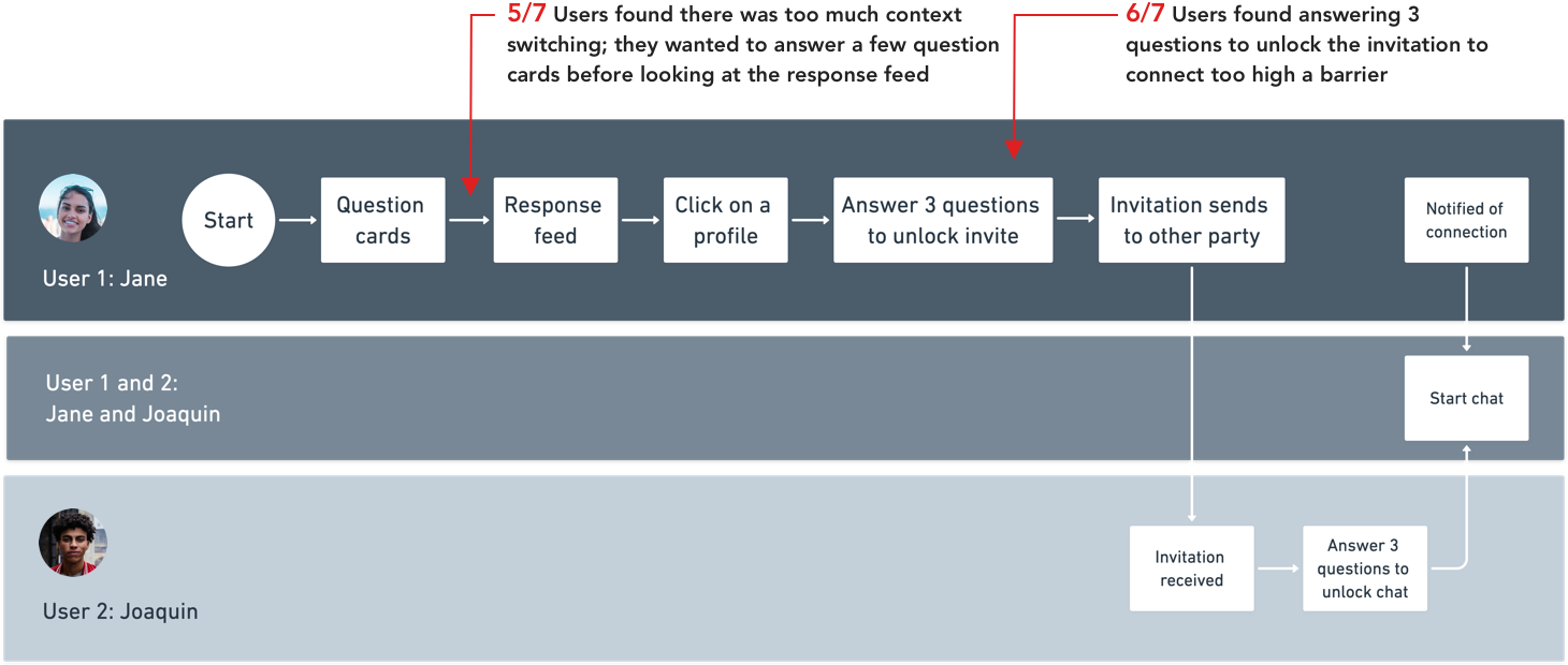
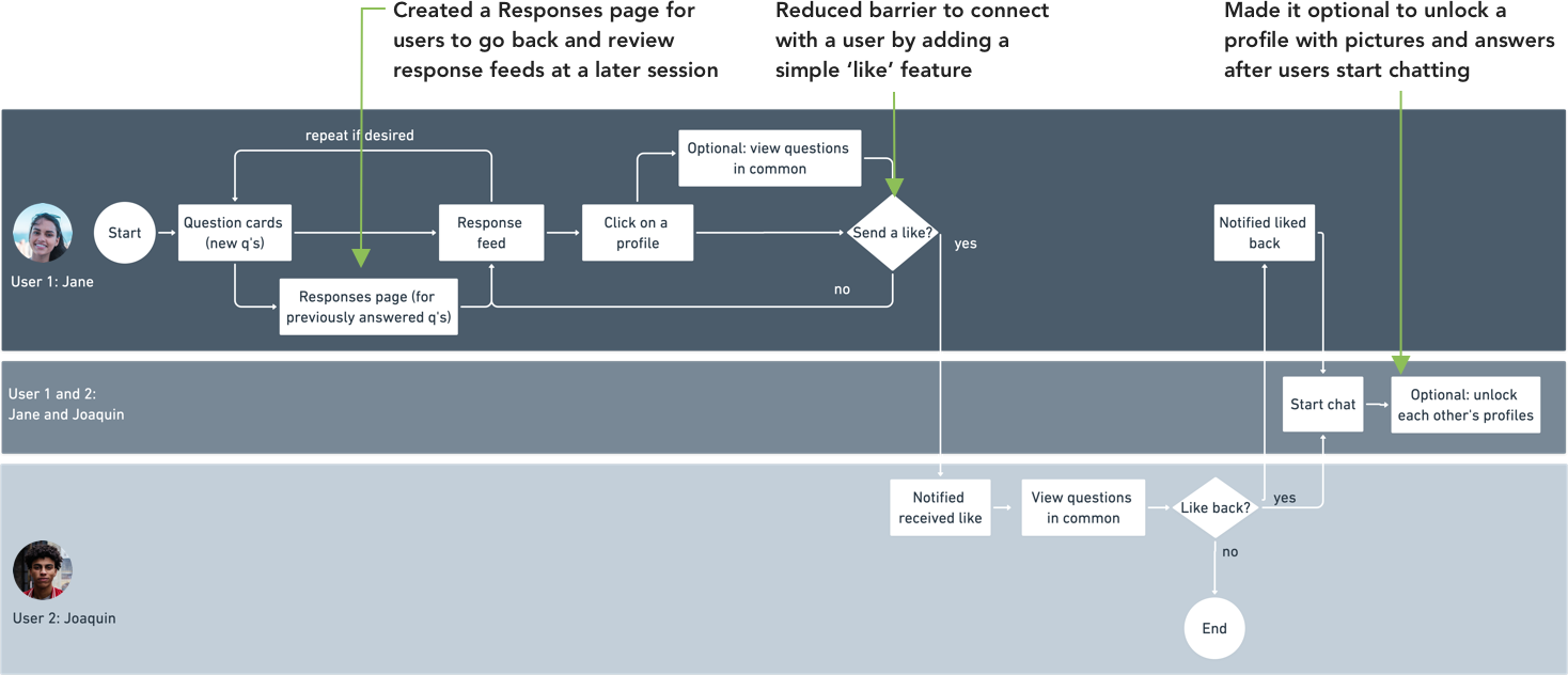
With each design iteration and user test, aspects of the task flow were adjusted to balance between collecting data for meta-analysis and providing a seamless user experience.
Before: Too much context switching and a high barrier to connect with other users
After: Users have the power to choose what they do next
FINAL PROTOTYPE
A refreshing take on the digital dating scene
Fireside Social was interested in exploring the interaction between users on a new dating feature that incorporates questions, meta-analysis, and most importantly, the facilitation of creating meaningful relationships.
RESULTS
14
Interviews
10
Usability Tests
6
Iterations
56
Final Screens
The final prototype was well received by users - all of whom had previous experience with dating apps. They felt the prototype offered a different experience than that of existing apps and would recommend it to people looking for a serious relationship. Though the product will take some time to build, the MVP offers a glimpse into a world where, with careful design decisions and intentional friction, deep connections can be fostered digitally.
RETROSPECTIVE
Reimagining modern dating is a beautiful yet challenging undertaking
With a nebulous challenge comes the responsibility of taking risks
With many stakeholders including the client and several user test participants, my team faced roadblocks trying to appease differing opinions. As the lead, I had to make definitive decisions on features and instill an environment of risk-taking in order for the team to continue making progress, which yielded positive responses from the client and users.
For next time, I’d like to source more test participants
With many differing opinions and dating styles, I would like to conduct user testing on more participants for this MVP. A larger number of participants would help uncover patterns in user behavior and give more confidence to any changes needed in the interaction.


